
Six Sigma gave us the discipline. AI gives us the velocity. Neither replaces the other, and the interesting question is not which one wins - it is what changes when the two run together.
For decades, Six Sigma practitioners have leaned on the Pareto principle. Sort your defect categories descending, and the 80/20 rule separates the vital few from the trivial many. It is elegant, proven and genuinely effective.
There is one catch. The analysis only moves as fast as the human behind the spreadsheet. Export the data, build the chart, sort it, spot the pattern, write it up. By the time the insight reaches a review meeting, the process has moved on.
That is the part AI changes - not the method, but the speed at which each stage of it can run.
What actually changes, stage by stage
Blending AI with Six Sigma does not replace the DMAIC framework. It removes the waiting from it.
- Define. AI mines historical data and customer feedback to surface problems you did not know to look for. The scope of a project stops being limited by what someone happened to notice.
- Measure. Instead of hand-building Pareto charts from static exports, an AI-assisted dashboard ingests live defect data, auto-sorts it, and highlights the vital few driving 80% of your quality issues - the moment the data lands.
- Analyse. The system does not just draw the chart. It states the finding in words: which category dominates, how much of the total the top two represent, where root causes connect across process steps that a human eye would have to go looking for.
- Improve. Predictive models recommend which category to attack first for the best return, and let you simulate the impact of a fix before you commit resources to it.
- Control. After each fix cycle, the distribution is monitored continuously. The moment the Pareto shifts and new categories rise to the top, you hear about it - rather than discovering it at the next quarterly review.
What that looks like on real data
Here is the dashboard running on a demo dataset of 420 defects across 10 categories. The bars are defect counts sorted descending; the line is the cumulative percentage; the dashed line is the 80% threshold.
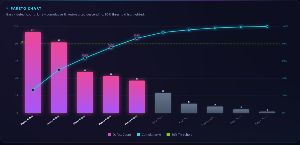
Five categories carry 86.4% of the total. Zipper Defect alone accounts for 26.7%, and the top two combined represent exactly half of all defects. The five long-tail categories beyond the 80% cut-off contribute just 13.6%.
That is the whole 80/20 principle - but the reading is done for you, in the time it takes to load a file.
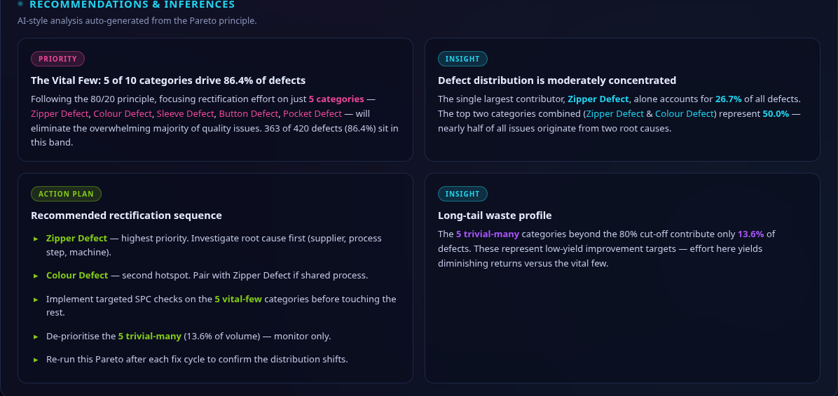
The panel on the right is where this stops being a chart and starts being a decision. It states the priority, the two supporting insights, and a recommended rectification sequence - Zipper Defect first, paired with Colour Defect if they share a process step, targeted SPC checks on the vital few, and the long tail monitored rather than chased.
The part that does not change
Notice what the tool is doing. It is sorting, counting, drawing and describing - faster than a person can, and without getting tired.
It is not deciding. It does not know that the Zipper Defect spike started the week a supplier changed, or that the Colour Defect pair is a symptom of the same worn fixture. It cannot weigh a fix against the cost of stopping the line, and it cannot walk onto the floor and ask the operator what they have been seeing.
The future of quality is not a choice between human expertise and artificial intelligence. It is giving every Six Sigma practitioner an AI co-pilot - one that handles the arithmetic so the practitioner can spend their time on the judgement.
Watch the animated version of this dashboard on LinkedIn.